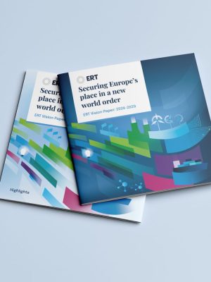
European Round Table for Industry
Creating a brand that could represent the diversity of ERT while maintaining a modest and clean approach.
date
2019-2024
client
ERT
European Round Table for Industry is comprised of some of the largest businesses in Europe and aim to promote sustainable growth and prosperity in Europe.
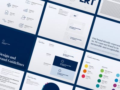
Creating strong visual branding
Our aim was to create a brand that could represent the diversity of ERT while maintaining a modest and clean approach. We knew that ERT needed a brand that was smart, clean and modest but we also wanted to bring out a sense of unity and collaboration. This idea lead us to explore visuals surrounding a circle comprised of concentric dots, each dot representative of the members of ERT and that everyone has a ‘seat around the table’. These dots then became a brand device we deployed across a large range of collateral, including the newly designed and built website.

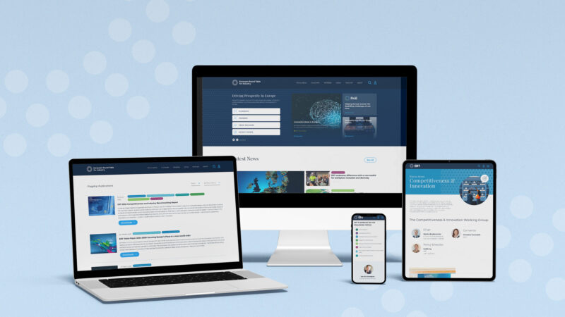
Website Design & Build
The aim of the ERT website was to create a resource to hold all of the documents, press releases and other business collateral that could easily be accessed by the public and ERT members. This meant creating a bespoke archive system with search functionality. We built content heavy pages which could be quickly and easily edited by ERT and gave them the flexibility to add content to their various sectors.
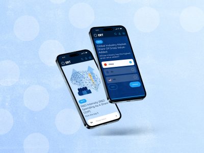
Bespoke Functionality
A user friendly search, archive and members page. In order to deliver a product that was user friendly and engaging, we focused heavily on the user journey and how we could have this as seamless as possible. This meant creating a bespoke search function to help filter the types of things users would be searching. We had to consider the documents, member and other content types.
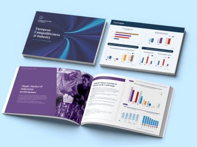
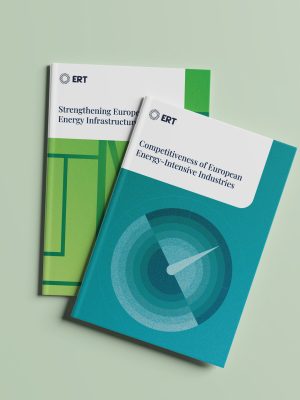
Print collateral
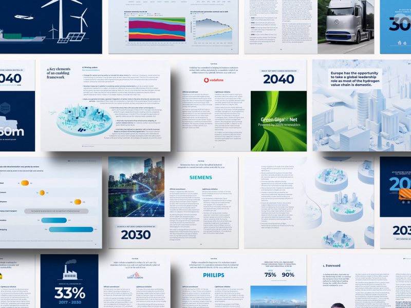
Accuracy and clarity are key. We’ve have been tasked by ERT to produce many printed documents. Many of which deal with a large number of charts, graphs and data-driven content. We rise to the challenge to take these otherwise bleak charts and make them interesting and cohesive with the wider ERT branding, whilst maintaining that all-important clarity of information.
